Showing posts with label My Own Research. Show all posts

Sunday, 11 December 2011

Superbad - IMDB

Storyline

Seth and Evan are best friends, inseparable, navigating the last weeks of high school. Usually shunned by the popular kids, Seth and Evan luck into an invitation to a party, and spend a long day, with the help of their nerdy friend Fogell, trying to score enough alcohol to lubricate the party and inebriate two girls, Jules and Becca, so they can kick-start their sex lives and go off to college with a summer full of experience and new skills. Their quest is complicated by Fogell's falling in with two inept cops who both slow and assist the plan. If they do get the liquor to the party, what then? Is sex the only rite of passage at hand?

Taglines:Come and Get Some

Genres: Comedy

Motion Picture Rating (MPAA) Rated R for pervasive crude and sexual content, strong language, drinking, some drug use and a fantasy/comic violent image

Official Sites: Sony Pictures [France] Sony Pictures [United States]

Country: USA

Language: English

Release Date:14 September 2007 (UK)

Filming Locations:
California State University Northridge - 18111 Nordhoff Street, Northridge, Los Angeles, California, USA

Box Office
Budget:$20,000,000 (estimated)
Opening Weekend:$33,052,411 (USA) (19 August 2007) (2948 Screens)
Gross:$169,871,719 (Worldwide) (4 May 2008)

Company Credits
Production Co:Columbia Pictures, Apatow Productions


Superbad Pre Title Sequence Analysis


  • First sign of visuals that we see is a boy dancing in a strange fashion. It doesn’t look like it’s a dance movie as the way he’s dancing is something you might want to laugh at.
  • First sign of typology that we see is plain block capitals that change colour if anything crosses it on screen, visual wise.
  • The colours used suggest this will be an upbeat film as there are bright colour used which correspond with the titles on screen as the colours mix to make new colours.
  • The music used is an upbeat dancing sort of music, but not music you would find at a dance contest but more at party or getting ready for a party.
  • The second character we see in this pre title sequence is larger than the first character who is more slim and tall. The second character is dancing just as stupidly as the first character as if they don’t know what they are doing.
  • A good technique is used within the visuals of this pre title sequence as the character has be quadrupled to give an added affect to the title sequence and make it look more funkier.
  • We then see the two characters together in one shot and this time it is only one dancing whilst the other one watches on as if the guy is telling him, this is how you dance.
  • The audience can clearly see that this film is about two guys who are probably good friends as they dance together and they probably do a lot of things together, we can see this as they feel comfortable dancing with each other and enjoying themselves.
  • The effects are once again used well within the title sequence as the two characters are double in the visuals and this once again makes it look cooler within the title sequence.
  • Towards the end of the title sequence we can once again see that these two are good friends as they almost have a good time dancing with each other in rhythm to the music and no matter how stupid they look, they still carry on.

The only indication that we as the audience get that this film belongs in the comedy genre is the way the characters dance in this pre title sequence as it makes the audience laugh in the way they attempt to look cool in dancing. The pre title sequence does communicate some light tones to the audience as you can see by the upbeat music and the bright colours that this will be a quite upbeat film with light tones about it.  

Sunday, 4 December 2011

Step Brothers - IMDB

Storyline

Brennan Huff and Dale Doback are both about 40 when Brennan's mom and Dale's dad marry. The sons still live with the parents so they must now share a room. Initial antipathy threatens the household's peace and the parents' relationship. Dad lays down the law: both slackers have a week to find a job. Out of the job search and their love of music comes a pact that leads to friendship but more domestic disarray compounded by the boys' sleepwalking. Hovering nearby are Brennan's successful brother and his lonely wife: the brother wants to help sell his step-father's house, the wife wants Dale's attention, and the newlyweds want to retire and sail the seven seas. Can harmony come from the discord?

Taglines: They grow up so fast.

Details

Official Sites: Sony Pictures [United States]
 
Country: USA

Language: English

Release Date: 29 August 2008 (UK)

Also Known As: Hermanastros

Filming Locations: 1987 Midwick Dr, Altadena, California, USA

Budget: $65,000,000 (estimated)

Opening Weekend: $30,940,732 (USA) (27 July 2008) (3094 Screens)

Gross: $100,468,793 (USA) (21 September 2008)

Company Credits

Production Co: Columbia Pictures, Relativity Media, Apatow Productions


Happy Gilmore - IMDB

Storyline

A Hockey player wannabe finds out that he has the most powerful golf drive in history. He joins the P.G.A. tour to make some money to save grandma's house. The downside is that his hocky player mentality doesn't really go on the P.G.A. tour. Especially with the favorite to win the championship.

Taglines: He doesn't play golf... he destroys it.

Details

Country: USA

Language: English

Release Date: 19 July 1996 (UK)

Also Known As: Adam Sandler's Happy Gilmore

Filming Locations: Burnaby, British Columbia, Canada


Box Office
Budget: $10,000,000 (estimated)

Gross: $38,624,000 (USA)

Admissions: 400 (Netherlands) (1 January 1998)
Filming Dates: 6 July 1995 - 1 September 1995

Company Credits
Production Co: Universal Pictures, Brillstein-Grey Entertainment, Robert Simonds Productions


Friday, 25 November 2011

National Lampoons Christmas vacation and European vacation Pre Title Sequence Analysis

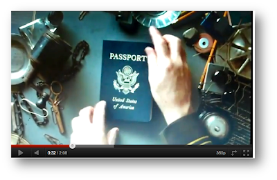
Lampoons European Vacation

Even though the quality in this video is quite bad, I still feel that this is a brilliant title sequence and that this could be along the lines of a title sequence that I may want to do. This pre title sequence is brilliant for the way the titles come up and it all flows.


  • ·      I think the using of titles and typology is used very effectively in this title sequence as when they guy stamps to show where this guy has been on holiday, it also stamps the actors name on the passport. To me this is very effective and smartly done as it makes the title sequence flow and just looks good as it blends in within the passport.
    ·      The typology used is the same as the stamp typology, but changed slightly in its own way to make it better and in my opinion I think this is the best I’ve seen with regards to fluidity since catch me if you can.
    ·      Also typology communicates something else to the audience as they are shown the main character passport have cancelled stamped a crossed it that makes you think that the holiday he maybe going on might go wrong.
    ·      The music is also once again indicating something to the audience as the lyrics are ‘holiday road’ this suggests that maybe this film isn’t necessarily about the flying aspect but can be about driving as well.
    ·      The audience are shown the film title on the same passport and in the same typology as used on the other characters name, once again very effective.
    ·      Three more characters names are shown within the pre title sequence in the same way as the first character, this could also suggest they too will be on holiday with the first guy, also it suggests to the audience that there is a link between these characters.
    ·      Even more brilliant typography mixed with visuals used as we are shown two characters who are shown to not actually have names so far and are called ‘the thief’ and ‘the bike rider’ but these two are also shown on the passport and the fluidity between showing one character and then the next is superb as one of the pass port pages is bent over and reveals the next character and his name is stamped over the folded pages which just makes the sequence flow so much.
    ·      Also there is a contrast between characters here as we are shown two characters, one with a smile and one looking devious also the page is folded between the two which could suggest to the audience that they are opposites and that one is nice and one is mean.
    ·      Just after we are shown these two characters we are shown more shots of passports, but it starts to get messy as a cup of coffee is knocked onto it which could suggest that this will be a messy holiday for those four who maybe travelling.
    ·      However this coffee spill then carries on to add to the effectiveness of this scene as the messy airport passport checker wipes away the spilt coffee and caries on stamping out the titles, for me the scene doesn’t ever stop flowing and just fits perfectly in with the music played and the visuals on screen.
    ·      Also the things such as the spilt coffee and the now ripped off piece of paper suggests to the audience that wherever the main character is going, you can tell that they are very clumsy and do not care for the persons passport who is entering their country.
    ·      The pre title sequence just keeps getting better in my opinion when referring to the fluidly s when we see more of the titles, a page is ripped to reveal the next title and this just works in terms of the fluidness of the title sequence.
    ·      Also the audience could think that because of all the things that have happened such as the ripped pages and coffee spill and now the cigar dropping on the passport, it once again suggests this will be a messy film with plenty of mistakes by the characters and plenty of mishaps.
    ·      Also the theme of international is carried on through the visuals right up to the end when we are shown a cigar, not many people smoke cigars in Britain, they mostly come from international countries.
    ·      Also the audience could most probably tell through he visuals and typology working together that this will be a comedy as this pre title sequence is already mocking airport passport checkers in saying that they are useless at there job and that they make a lot of mess and have no care for there job at all. 


·        In conclusion I think that this pre title sequence is one of the best I’ve ever seen since catch me of you can, it’s the best I’ve ever seen just for its fluidity and how it flows from one title to the next and how it shows each character with so much rhythm according to the music. To me every aspect of this pre title sequence best describes the codes and conventions of pre title sequences and how they should be. As the pre title sequence tells a little story within itself and gives the audience that little taster as what the film maybe like. It also entertains the audience fully in the way it has been created and shown to the audience and if I had the choice on how to best base my pre title sequence, I would do it like this one and change it in my own way to make it my own idea and attempt to make it better.


National Lampoons Christmas Vacation


  • sound straight from the start indicates to the audience that this is a christmas song, we are able to tell this as all the signs of christmas music are there, from the high tones of the tambourines used and the music that wants to make you sing along.
  • we are able to tell this film is set around christmas by the lyrics of the music used... 'christmas vacation'.
  • the first shot we see is of the moon in the dark starlit sky. We then see santa's reindeer go across the screen which indicates for sure to the audience that the film is something to do with christmas or around the christmas time.
  • also we as the audience can already tell that this is a cheery light hearted film as the music is nice and the santa clause going across the screen indicates that it is a time of happiness as its christmas.
  • the typology used is very bold white lettering which unlike the pre title sequence before, sticks out of the visuals like a soar thumb and does not flow.
  • the typology used is white, bold, capital lettering.
  • when we get the first sighting of the sleigh and santa we cannot see that it is animated, however when we get a proper look at him and the colors that go with him, we can clearly tell that this is an animated pre title sequence, which could suggest at first that the film is for kids.
  • the name we are shown by the visuals on the animated father christmas is of 'Griswold' this indicates the film maybe around this family.
  • the point above also tells us that perhaps this family always gets left to last and most probably always gets the short end of the stick.
  • we are shown the first indication that this film is a comedy through the way that santa tries to clim onto the Griswold house from his sleigh but the snow gives way and he falls. Suggests that their house could have things go wrong with it and that humor maybe involved with their house within the film.
  • the father christmas and the snowman could suggest to the audience that this is in fact a family film as it communicates to the audience that there is a family with quite young kids involved with this film which maybe the Griswold family.
  • another comedy element has been shown within this pre title sequence which suggests more to the audience that this is a family comedy as santa attempts to put the button back on the snow man but it ends up falling and chasing after him.
  • comedy is shown more and more as the pre title sequence continues as santa puts his finger into a broke light bulb and gets electrocuted, this and many of the other things that happen to santa throughout the pre title sequence could be the reason why the Griswold family has been left to last as it is the house and family that causes the most problems.
  • the end of this pre title sequence communicates to the audience that there will be non stop comedy used in this film as we see plenty more stupid things happen to santa that accidentally happen but leave us smiling at it as we find it funny in our minds.
In-conclusion, i think the animation of this pre title sequence really does add to the comedy of this as it allows the pre title sequence designer to communicate comedy and the family feeling in any way possible through the animation of of all the visuals and the father christmas himself. There are two main elements communicated throughout this pre title sequence which are the family element and the comedy element. The family element is indicated to the audience through its use of father christmas and the snowman, but also through its use of the christmas time of happiness and celebration. The comedy element of the pre title sequence is communicated to the audience through its use of the animated father christmas within the sequence as funny stupid things happen to him by accident because of some of the faults of the Griswold families house.

Thursday, 17 November 2011

28 Days Later And Edward Scissorhands Pre Title Sequence Analysis


  • Straight from the start the sound indicates to the audience that the film with have a light touch at the beginning but can rapidly change at any point and catch you off guard. This communicates to the audience that the even when there is light music playing, it does not necessarily mean that they are safe.
  • The typography used is very plain white lettering that to me does not have any effect or meaning apart from it is in capitals which could suggest laboratory writing of some kind.
  • The first sign of visuals that we are shown is of a monkey with what look to be mind testing cables coming out of its head, this suggests to the audience that they are monitoring something within the monkeys mind.
  • The monkey is tied down which suggests to the audience that there is a valid reason for not letting him walk around and be free. The monkey is also being forced to watch what looks to be vandalism to on many screens which could be the reason that he is tied down as there could be some hint between these two things.
  • The light sound track at the beginning of this sequence soon changes when we are shown the title of the movie, this suggests that the title is bad or is feared in some kind of way.
  • The typography for the title changes slightly as when the heave music kicks in over the light music, a burst of red goes through the title of the film. This could suggest that there will be blood involved within this film, it also could indicate that something is being injected with blood or just injected with a toxin of some kind. This could be linked back to the monkey in the previous scene who is tied up. The injection of the colour red into the title suggests that there will be blood involved within this film and that this is an aspect for which the audience can expect.
  • From this point onwards the typography of the titles are now splattered with blood stains throughout the rest of this pre title sequence, this could suggest to the audience that throughout this 28 days that passes, there is a lot of blood shed within that period of time.
  • The visuals start to communicate more to the audience towards the end of the title sequence as we are shown through CCTV cameras the violence and fighting going between people which suggests to the audience that this is expected to happen in the film.
  • Once again the visuals are used to communicate meaning to the audience as we see a man walking alone along empty streets in London. Anyone who has been to London or knows of this city will know that London is never that empty so this suggests to the audience that there is something wrong and that something isn’t right. It also communicates to the audience a little of what they are to expect within the film as a man walks alone with no one to be seen. This creates an enigma amongst the audience which is, ‘where are all of the people who are supposed to be here?’
  • The blood stains on the typography look like the ones as if someone has been brutally killed and then dragged across a white flaw. This suggests to the audience that there will be killing involved within this film.
  • The music used throughout the second half of this sequence is a very hardcore piece of music with heavy drums and electric guitar.
  • Towards the end of the pre title sequence we are shown a monkey going wild in a see through cage. This could be the monkey from earlier as he is the audience now establish why he was chained up. But as you can see in the monkey’s eyes, something isn’t right as it tries to brake itself free out of its cage.

In-conclusion, the pre title sequence of 28 days later has been made to communicate the fact that the film is a epidemic horror and that the audience are to expect fast paced editing and a lot of blood used during this film, also the audience are to expect scenes within the film that will catch them off guard and make them jump. All of these things have been communicated to the audience through the sound, visuals and typography. The sound has communicated the fact that there will be scenes that catch the audience off guard as the light music in the begin soon changes when we are shown the title as the light music is cut straight to heavy drums and electric guitar music. The visuals throughout this scene have contribute to the communication to the audience by the way it has shown the violence through CCTV as well as the monkey shot at the beginning and end of the scene, this creates a sense of fear amongst the audience as now they don’t know what to expect as they’ve seen the look in the monkey’s eyes and if this has spread to humans, then what are they going to be like. Finally the typography through the second half of this scene has been used to communicate to the audience that there will be plenty of blood used in this film and that is one of the main things that the audience will see.


  • First shot is of the film company, the films companies usual logo has been edited in some way to show that it is snowing this could communicate to the audience that there will be a time when its snowing in the film and that it might play a key part.
  • Typography straight from the start is long, white, capital lettering. The long part of the lettering with its sharp edges look significant to me and could be significant to the audience as well as it could suggest that this film may be raggedy in some way.
  •  The visuals communicate meaning to the audience in some of the first shots by the way the door is opened for us, this indicates to the audience that this is a very important door in the film. It may not be the door itself but the building it belongs to perhaps.
  • Behind this door we are shown pure darkness and then the film title shows in original typography. The film title is ‘Edward Scissorhands’ this may sound like a name to the audience which could indicate that this man or boy or child could live behind this door and could live in the dark.
  • The typography once again creates meaning for the audience as this time it has a transition used on it to make it move in a certain way. The title of the film looks like its making a crocodile’s mouth movement or even more significant a scissor movement to suggest to the audience that within this film there will be some sort of reference to the scissors that will be linked with the man or boy called Edward.
  • As the scene progresses we are shown more of what is behind the door and the audience are then able to establish a setting that may feature within the film. The inside of the building is old and dusty which shows that not many people go there and that the last time a person was there, wasn’t any time soon.
  • As the visuals move us up the steps of this building the audience is shown a dark room that we cannot see the inside of. This can communicate to the audience that low key lighting may be used in the film and it will mostly be used when in this setting.
  • The visuals once again create meaning for the audience as we are shown what seems to be the making of a robot, but what is even more significant is the fact we get shown scissors which have been a key symbol that keeps cropping up throughout this pre title sequence that the audience can now establish is something important to the film.
  • As the title sequence goes on we are shown more and more of these robots being made, which indicates to the audience that this setting may have once been a factory.
  • Another key symbol has been used in this pre title sequence towards then end as we are shown what look to be a pair of artificial hands. The title designer would not have just thrown this in there if it did not mean anything to the film, so this communicates to the audience that the artificial pair of hands shown in the title sequence are a key signifier when it comes to this film.
  • Just at the end of the title sequence we are shown a character and snow begins to fall once again just like it did at the beginning, the final shot is of a building on a hill. I think that all of these visuals can be linked together, as you could interpret this by saying that the snow over the character we are shown could suggest that he made this snow happen or has something to do with it, you could also say that house on the hill is linked with the door at the beginning of this pre title sequence and that we as the audience have been shown the inside of this house.
  • The soundtrack used in this pre title sequence is very light music, the sort of music that you would associate with a church around Christmas time, the sort of thing that would be sung by a choir if you was to go in there. This communicates to the audience that the film will have a very light touch about it with regards to the narrative but also that it may be set around Christmas time at one point in the film.
In-conclusion the whole meaning that the pre title designer has tried to get across to the audience is that a link between the house, the man at the end of the sequence, the scissors and the snow will all be established within the film and that all of the audiences questions that they have will be answered, but in time. A lot of key symbols have been used throughout this sequence to get the audience involved with asking questions such as ‘why has the scissors just been randomly put there? What significance does that have?’ these are the questions that the pre title designer wanted the audience to have as then he knows that he has had an effect on what we expect the movie to be like. The audience know that there will be a house/castle setting used as they have seen it in the title sequence and the audience expect to see low key lighting used within that house, but what the audience can’t work out is what is the link between all the things above and how do they piece together.

Sunday, 13 November 2011

Pre Title Sequences (Background on Kyle Cooper)

Kyle Cooper (Born July 1962) is a modern designer of motion picture title sequences. Kyle Cooper studied graphic design under Paul Rand at Yale University. Early in his professional career, Cooper worked as a creative director at R/GA (an advertising agency with offices in New York and Los Angeles). During this period, Kyle Cooper created the title sequence for the 1995 American crime film Se7en, a seminal work which received critical acclaim and inspired a number of younger designers. According to Kyle Cooper, at the time he made the title sequence for Seven, main title sequences were behind of what was happening in print, music videos and commercials. He wanted to create main titles that were raising the bar creatively.

In 1996, he co-founded Imaginary Forces (a creative agency that came out of the West Coast division of R/GA). "We have spent a long time building and refining a brilliant creative and production team ... Keeping this group together as our own company is truly exciting," commented by Kyle Cooper about the name change. Too involved by the business-side of running a design company the size of Imaginary Forces, Kyle Cooper decided it was time for him to focus more on his creative work, so he left Imaginary Forces.
In 2003, Kyle Cooper founded the creative agency Prologue. Prologue, initially located in Malibu moved to offices in Venice Beach (Los Angeles) in 2008. throughout Kyle Coopers career in modern design of pre title sequences, some of  his work in the field has been often compared to Saul Bass. Kyle Cooper has also directed a feature film, New Port South (2001). Kyle cooper has made many title sequences in his career such as braveheart, the mummy and any more, one of his title squences that he has designed is spider-man which i have looked at and analysed below.


  • Bold white lettering with a thick red outline has been used around the outside of the titles to suggest that the colours red and white play a big part in this film, also most of the red and white movie titles have been used on a blue background which also suggests this colour play a part in the film as well.
  • The word ‘Marvel’ used at the beginning of the pre title sequence is shown as big and bold and is revealed through a series of pictures through a comic book which suggests to the audience that there is a comic book element to the film.
  • The typology is bold and stands out, but there it’s very edgy (very pointy at the end of the lettering) none of the titles throughout are smooth, I think this makes the titles stand out more than they already do.
  • Each of the titles as they are shown disperse and fly at the screen once they have been shown, this suggests that there is a flying element about this film.
  • The name of the film is shown in the same font as the rest of the titles but to communicate to the audience that it’s the title it has been put in bigger writing and has a white light coming from behind it which suggest that the title ‘spider-man’ is a sign of purity and goodness. From here on in the pre title sequence instead of the letters flying towards the camera, it seems to become more fluid as they now fly in the opposite direction and lead you to the next title, this is more fluid and makes the audience feel like they are flying or travelling through the air this indicates to the audience that the film will feature in the air at some point.
  • The sound is very building throughout the pre title sequence, the sort of soundtrack that has been used is very deep and light at the same time and goes up and down throughout the sequence to build tension as if it leads up to something, this gets the audience on the edge of there seat and indicates to the audience that this is what the film maybe like.
  • The music is very upbeat in this sequence and makes you feel like you’re on the move all the time, like your non stop on the move and you never stop. This communicates to the audience that this maybe a theme in the film.
  • Finally the sound track used sounds like the music used for a superhero when they are about to fly in and clear up the danger or save the day. The music played is the music that you would associate with a superhero. This indicates to the audience that one of the characters or even the main character in the film could be a super hero.

In-conclusion the main idea that Kyle Cooper has tried to indicate towards the audience is that the there is some sort of superhero involved within the film and that the colours red, blue and white are also to do with the film in some way shape or form. Kyle Cooper has indicated this through the typology and sound used in this pre title sequence to try and communicate these themes to the audience. In my opinion Kyle cooper has done the successfully and as you can see when watching the pre title sequence you can feel that it has a superhero waiting to pop out at any moment and burst through the screen as the music builds and builds as more and more titles are shown.


  • Red fiery typology straight from the start for the titles suggests there will be plenty of action involved within this film. The font is bold neon red that is in capital letters, it is straight edged and is not smooth, looks to me in my opinion like a hardcore sort of font. The font reminds me of like a dare devil show where a stunt man would get on a motor bike and do a huge jump through the rings of fire and the billboards advertising it, the font that would be on there would remind me of the font seen in this pre title sequence.
  • Also the writing looks like a kind of robot writing. Such as if you was to see a film with a robot of some kind in, then the writing that was on them like their name would look like that, in complete block capitals.
  • Furthermore the writing is in time with the visuals on the screen, as in it follows what is happening within the shot. It’s always moving in the right place at the right time, it’s not just in the middle of no where. This could suggest to the audience that the ‘iron man’ is always in the right place at the right time.
  • The main character is shown within the titles (Robert Downey Jr) the audience are able to establish he is the main character as his name is brighter and stands out the most out of all the titles, except the film title. Also the typology has been placed in a specific position by Kyle Cooper which is over the mask of the robot, this communicates to the audience that he will be the face behind that robot and he will be that man who gets inside the robot as the ‘iron man’.
  • For the music heavy drums and electric guitars have been used for the sound track in this pre title sequence to indicate to the audience that this is going to be an explosive action packed film that is going to be upbeat and will never have any flat moments throughout.
  • The visuals indicate that the man in the first shot could be the main character. Also in the first shot it looks like he is addressing the media as there are photos being taken of him which could suggest he is well known by the public within the film.
  • Finally the shot cutting from him to the making of a robot could suggest that he made this machine and that he why the press and the media is taking photos of him, this is just a suggestion, however we can be sure that the robot in the rest of the pre title sequence has something to do with him.

In-conclusion, Kyle coopers whole aim of this pre title sequence was to communicate the fact that this film (Iron Man) is going to be action packed that and will explode on to your screen when you watch it. Kyle cooper has indicated this through the typology, sound and visuals. He has done this through the typology by the way he has used bold neon bright red writing that is in capital letters in order to stand out and get the audiences attention and communicate to them that this film isn’t for the faint hearted of people. He has also used the connotations within music to indicate to the audience just what sort of film this is, the sound track Kyle Cooper has used is a hardcore piece of music that uses a lot of drums and electric guitars to connote the fact that there is a lot of explosions and hardcore action in this film. Finally the visuals have been used by Kyle Cooper in this pre title sequence mostly to indicate who the main character is in this film and he has shown this in the first shot as we see Robert Downey Jr being interviewed by the press and this then cuts to the making of a robot (Iron Man) which the audience immediately link with the man shown in the first shot which is the main character (Robert Downey Jr).