In this lesson we as the film production company watched the film pitches to see which one best suited our film company. There were three film pitches being presented to three film companies and each pitch matched to one of our film companies. Our job as the film compnay was to do research into our own film company which was Paramount Vantage and to know the film companies ins and outs ready for the film pitches we was about to be given. The film pitchers also had the task of researching the film company they had been given so that when they thought up the idea for their film pitch they had based it around the production company they had been given.
Each pitch was presented to us and we as the film company had to look at different aspects of their pitches and see which suited our production company the best out of all the other pitches. When we heard the pitches my group knew exactly which pitch belonged to our production comapny as the filmwas a low budget, American, teen comedy called 'good boys', they got the idea from the film mean girls.
Once they had pitched to us and we knew straight away that the film belonged to our film production comapny and so now we had to present our presentation on our film company (Paramount Vantage) to the rest of the people who pitched and the other film companies and at the end of the pitch we told the class which pitch we thought best suited our film company and why it best suited our film company, we guessed right in thnking that this film was suited for our film company as our group had done its research well and was knew what we was looking for in terms of what the pitch was to be like. This is mine and Luke's pitch on the film production comapny Paramount Vantage:
Monday 28 November 2011
Happy Gilmore And Step Brothers Pre Title Sequence Analysis
Happy Gilmore

Step Brothers

- immediately we as the audience can tell by the music used that the pre title sequence will be about someone communicating what has happened so far in their life to the audience
- or in fact the music sounds like someone should be talking over the top of it as it sounds to light to be played by itself
- the typology used is very bland white block capital lettering that doesn't necessarily connote anything to the audience if the font they have used or the way it has been laid out
- the tone of the music is very light, suggests to the audience that this isn't a horror as its not the type of music you would use for a horror
- the audience have also decided in their heads from the music that in the film there may be a light tone used and that there are no deep dark scary scenes used that have the intentions to scare the audience
- the first sign of visuals that we see is of an old filming that is placed towards the right of the screen in a box, the visuals is of a little boy playing hockey on the street, this links in with what i said about the sound above as the voice over kicks and the audience find that they are being told a life story
- comedy elements have been communicated to the audience through the use of visuals within this title sequence as the boys dad is hit with a puck which kills him, somehow the comedy element is communicated through this by the way that the voiceover makes it sound so easy to get over and how it doesn't bother him in the slightest
- the effectiveness of the way the visuals have been presented in this title sequence are almost like old movies that flicker, this is effective as it shows that the character Happy Gilmore is showing his life story up until the point he is at now and we can see this by the way it is shown in the style of old movies
- throughout the pre title sequence the titles are shown to the left of the visuals that are going on
- more comedy elements are brought in towards the end of this pre title sequence as he is now showing how he is getting older and the hobbies he done and the jobs he also under took
- the voiceover is used effectively in this pre title sequence as it describes what is happening in the visuals and Happy Gilmore's life story up to date and now the audience have an understanding of where the film is at now as it cuts into the begginining of the film, the present time he is at in his life
In-conclusion, i think that the audience can tell this is a comedy straight away by the comedy elements used throughout this pre title sequence. The comedy elements kick in more towards the end of the title sequence as Happy starts to tell the audience more about his life that is closer to the present day such as the previous jobs he's had. We can tell through the high key lighting, the music and the voiceover used that this clearly isn't a horror or thriller as these things are what mostly indicate to the audience that this film belongs in the comedy genre and no where else.
Step Brothers
- typology used at the beginning of the pre title sequence indicates to the audience that the film will be about families and that perhaps the film maybe set in America
- also a quote is used write from the beginning and the quote is American which also suggests that this is a typical American family
- the typology used to show the titles is like a comic sort of font and is in big lettering so stands out to the audience
- the comic feel to the typology used in this pre title sequence suggests that perhaps the film is a comedy as the titles have a comic feel to them and comic books make people laugh, so this communicates to the audience that the film has the intention to make them laugh
- the visuals in this pre title sequence at first indicate that the man who is eating likes to eat quite fatening foods
- the music kicks in within this sequence and indicates to the audience that this is a very upbeat film, we can see this through the sound track that is a very upbeat sort of music. We as the audience can hear that it is a very upbeat piece of music as electric guitars and drums have been used to make this soundtrack
- the second character that we see isn't wearing any clothes on the his torso and smells a piece of clothing which looks to be a top, this suggests to the audience that he doesn't do the washing very much as he is having to smell his own clothes to see if he can wear them or not
- the visuals indicate to the audience that the first character we see likes eating a lot of food as we see him with a bowl of cereal aswell as the tortilla chips coverd in cheese
- the audience can straight away tell that there will be some elements of humour within this film as the first character we see is living at hom with his mum and we can also tell that he doesn't work that much as when his mum is going to work, he is only just having breakfast
- the character pays more attension to the TV then he pays to his move, this implies that he enjoys the TV more than having a conversation with his mum or listening to anything she says
- more comedy elements are communicated to the audience as he tells his mum hes not watching anything important but when she goes he turns the channel onto aerobics and puts his hand down the front of his trousers
- the second character who we havn't seen much of in the pre title sequence also looks like someone who is out of work and doesn't do much like the first character as he is playing guitar hero
- more comedy elements are communicate within this pre title sequence as the second character also like the first one like porn according to his dad, it is also indicated to the audience that he doesn't earn any money as he still has to get money off his dad for food
- final comedy elements are communicated as the father of one of the characters says in a speech/conference how he would like to put his face into the mum of the other characters breast, this indicates humour to the audience and sets the tone of the film as being comedy themed
- the typology throughout this title sequence is almost like the music, you don't tend to notice it as it doesn't stick out within the frame at all or when listening whilst watching the visuals
In-conclusion the fact that this film is from the comedy genre has bee communicated to the audience through the use of visuals and dialouge used. Also typology could also have an effect on the audience which could lead them to believe that this film is also part of the comedy genre. The visuals that have been communicated to the audience that this film belongs in the comedy genre is through the use of characters and props as the two characters who live with their parents use the props to communicate humour to the audience. Also things such as the dialogue have also been used in this pre title sequence to communicate humour, especially in the last part as the dad of one of the characters is staring at the mum of the other character and he quotes 'want to pu my head in those breasts' this communicates to the audience and certifies them that this is definatley a funny film that belongs in the comedy genre. The typology also plays a small part in this pre title sequence as it is like a comic book font which ones again impliea to the audience that thia is a film from the comedy genre.
Ground Hog Day Presentation And Thinking Of Ideas For A New Film That We Will Make The Pre Title Sequence For
In this lesson each group presented their own idea of the pre title sequence for the British version of Ground hog day. We then gave each others presenting skills and the ideas itself a mark out of 10 and gave feedback on what was interesting about the idea, what was good about the idea, also what could be improved about the idea of the pre title sequence. We went through each group’s idea and they presented either a picture of series of pictures they had made in Photoshop in order to communicate to the audience what there thoughts and ideas for this remake of the pre title sequence Ground Hog Day was about. When each of the groups presented their work they each had to justify why they used that certain picture, why they used the typology and what their whole idea from start to finish is for the pre title sequence of Ground hog day.
When it came to presenting my idea for the pre title sequence, the presentation of the pictures we had made went okay, but when getting feedback on our work, the feed back was very helpful and made me understand more as to just what a pre title sequence is. Such as some of the feedback that we got from other people was things such as it sounded to much like the trailer to the film and that we was giving the film away a bit too much with what would be included within the pre title sequence. The feedback was very helpful with my own understanding of pre title sequences and my group’s ideas on pre title sequences, as now we know exactly what we are looking to do when trying to make our own pre title sequence for the new film idea we have made.
Further on in the lesson after all the group’s in the class had presented their idea for the British remake of the pre title sequence for film Ground hog day, we then moved onto brainstorming a few ideas for our own pre title sequence and coming up with a whole new idea for a film as then it would be easier for the groups to be able to make their film as then they would know the film in and out and would be able to create a pre title sequence that best communicated to the audience some of the themes and patterns that may happen throughout the film. During that lesson we wasn’t meant to think about the pre title sequence of the film, but just to think about the film itself and the characters we would use and how the narrative would unfold. My group made a brainstorm of these ideas and made sure to cover all angles of creating a film idea and this is what I have sown in the brainstorm below, my group’s ideas for the idea of our film, which we will later make a pre title sequence for.


My Brainstorms, Lesson 5, Lesson 6 And My Own Research
The things i have learnt and got ideas on from my past few posts are my brainstorms on the genres; drama, comedy, horror and action for thoughts on my own pre title sequence, also my lesson 5 and 6 has helped my greatly in thinking about my own ideas for my pre title sequence.
The four brainstorms that i did helped me as they allowed me a greater look into some of the genres that i may consider to do when it comes to thinking of ideas for my pre title sequence. The genre that i thought went most well and that i could write plenty of information on was the drama genre, as it would be very easy to make this sort of title sequence in a school. Also the ideas that i have thought of specificly for this genre are vast and are very well thought through, so when it comes to thinking of what to do for my groups pre title sequence and thinking of the genre and narrative, then i will have some input as to what we may want to do. The two genres that i thought didnt go down so well when brainstorming was the action and horror genre, these didnt go well, as i couldnt think of the full narative that may occur in the film and i also struggled to put together a narrative.
Lesson 5 helped me boost some of my ideas when it came to my pre title sequence as it allowed me to understand how a film pitch is created and also when it comes to the production companies i was able to understand what the big 6 are or as some would say the big 2 and the little 3. Also when it comes to understanding film production i am now able when making my own idea for my film with my group, it ill allow me to understand what budget i need, also it allows me to understand if i was to make an idea for a film, i would know what film company would want to buy this idea off of me.
Lesson 6 was a very helpful lesson to me as it allowed me to catch up with any coursework that i needed to complete on my blogger. When entering the lesson i was already up to date with most work on my blog so this lesson allowed me to do further research into the pre title sequence world and to explore more films pre title sequences and allow my ideas to expand beyond all imagination.
Friday 25 November 2011
National Lampoons Christmas vacation and European vacation Pre Title Sequence Analysis
Lampoons European Vacation
Even though the quality in this video is quite bad, I still feel that this is a brilliant title sequence and that this could be along the lines of a title sequence that I may want to do. This pre title sequence is brilliant for the way the titles come up and it all flows.
Even though the quality in this video is quite bad, I still feel that this is a brilliant title sequence and that this could be along the lines of a title sequence that I may want to do. This pre title sequence is brilliant for the way the titles come up and it all flows.
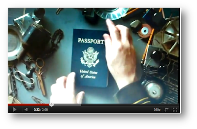
- · I think the using of titles and typology is used very effectively in this title sequence as when they guy stamps to show where this guy has been on holiday, it also stamps the actors name on the passport. To me this is very effective and smartly done as it makes the title sequence flow and just looks good as it blends in within the passport.· The typology used is the same as the stamp typology, but changed slightly in its own way to make it better and in my opinion I think this is the best I’ve seen with regards to fluidity since catch me if you can.· Also typology communicates something else to the audience as they are shown the main character passport have cancelled stamped a crossed it that makes you think that the holiday he maybe going on might go wrong.· The music is also once again indicating something to the audience as the lyrics are ‘holiday road’ this suggests that maybe this film isn’t necessarily about the flying aspect but can be about driving as well.· The audience are shown the film title on the same passport and in the same typology as used on the other characters name, once again very effective.· Three more characters names are shown within the pre title sequence in the same way as the first character, this could also suggest they too will be on holiday with the first guy, also it suggests to the audience that there is a link between these characters.· Even more brilliant typography mixed with visuals used as we are shown two characters who are shown to not actually have names so far and are called ‘the thief’ and ‘the bike rider’ but these two are also shown on the passport and the fluidity between showing one character and then the next is superb as one of the pass port pages is bent over and reveals the next character and his name is stamped over the folded pages which just makes the sequence flow so much.· Also there is a contrast between characters here as we are shown two characters, one with a smile and one looking devious also the page is folded between the two which could suggest to the audience that they are opposites and that one is nice and one is mean.· Just after we are shown these two characters we are shown more shots of passports, but it starts to get messy as a cup of coffee is knocked onto it which could suggest that this will be a messy holiday for those four who maybe travelling.· However this coffee spill then carries on to add to the effectiveness of this scene as the messy airport passport checker wipes away the spilt coffee and caries on stamping out the titles, for me the scene doesn’t ever stop flowing and just fits perfectly in with the music played and the visuals on screen.· Also the things such as the spilt coffee and the now ripped off piece of paper suggests to the audience that wherever the main character is going, you can tell that they are very clumsy and do not care for the persons passport who is entering their country.· The pre title sequence just keeps getting better in my opinion when referring to the fluidly s when we see more of the titles, a page is ripped to reveal the next title and this just works in terms of the fluidness of the title sequence.· Also the audience could think that because of all the things that have happened such as the ripped pages and coffee spill and now the cigar dropping on the passport, it once again suggests this will be a messy film with plenty of mistakes by the characters and plenty of mishaps.· Also the theme of international is carried on through the visuals right up to the end when we are shown a cigar, not many people smoke cigars in Britain, they mostly come from international countries.· Also the audience could most probably tell through he visuals and typology working together that this will be a comedy as this pre title sequence is already mocking airport passport checkers in saying that they are useless at there job and that they make a lot of mess and have no care for there job at all.
National Lampoons Christmas Vacation
- sound straight from the start indicates to the audience that this is a christmas song, we are able to tell this as all the signs of christmas music are there, from the high tones of the tambourines used and the music that wants to make you sing along.
- we are able to tell this film is set around christmas by the lyrics of the music used... 'christmas vacation'.
- the first shot we see is of the moon in the dark starlit sky. We then see santa's reindeer go across the screen which indicates for sure to the audience that the film is something to do with christmas or around the christmas time.
- also we as the audience can already tell that this is a cheery light hearted film as the music is nice and the santa clause going across the screen indicates that it is a time of happiness as its christmas.
- the typology used is very bold white lettering which unlike the pre title sequence before, sticks out of the visuals like a soar thumb and does not flow.
- the typology used is white, bold, capital lettering.
- when we get the first sighting of the sleigh and santa we cannot see that it is animated, however when we get a proper look at him and the colors that go with him, we can clearly tell that this is an animated pre title sequence, which could suggest at first that the film is for kids.
- the name we are shown by the visuals on the animated father christmas is of 'Griswold' this indicates the film maybe around this family.
- the point above also tells us that perhaps this family always gets left to last and most probably always gets the short end of the stick.
- we are shown the first indication that this film is a comedy through the way that santa tries to clim onto the Griswold house from his sleigh but the snow gives way and he falls. Suggests that their house could have things go wrong with it and that humor maybe involved with their house within the film.
- the father christmas and the snowman could suggest to the audience that this is in fact a family film as it communicates to the audience that there is a family with quite young kids involved with this film which maybe the Griswold family.
- another comedy element has been shown within this pre title sequence which suggests more to the audience that this is a family comedy as santa attempts to put the button back on the snow man but it ends up falling and chasing after him.
- comedy is shown more and more as the pre title sequence continues as santa puts his finger into a broke light bulb and gets electrocuted, this and many of the other things that happen to santa throughout the pre title sequence could be the reason why the Griswold family has been left to last as it is the house and family that causes the most problems.
- the end of this pre title sequence communicates to the audience that there will be non stop comedy used in this film as we see plenty more stupid things happen to santa that accidentally happen but leave us smiling at it as we find it funny in our minds.
In-conclusion, i think the animation of this pre title sequence really does add to the comedy of this as it allows the pre title sequence designer to communicate comedy and the family feeling in any way possible through the animation of of all the visuals and the father christmas himself. There are two main elements communicated throughout this pre title sequence which are the family element and the comedy element. The family element is indicated to the audience through its use of father christmas and the snowman, but also through its use of the christmas time of happiness and celebration. The comedy element of the pre title sequence is communicated to the audience through its use of the animated father christmas within the sequence as funny stupid things happen to him by accident because of some of the faults of the Griswold families house.
Thursday 24 November 2011
Blogging Catch Up
In this lesson we had a whole hour devoted to blogging and catching up with our blog. When going into this lesson i was already very ahead with my work and so i had a chance to make my work on my blog look that little bit better and to go through and edit any mistakes that i may have made. I also have been able to make any changes that i have needed to and move around anything i may have needed to in order to make my work look more professional and more presentable.
Wednesday 23 November 2011
Paramount Vantage Film Studio PowerPoint - My Own Contribution
In this lesson we was put in groups and given the class groups were slip in half into film producers and film directors. Each of the film producers groups were given sheets that had a film company on it that they would have to find information on according to some of the questions asked on the bit of paper. The film producers were the same, they were each given a film company that the film companies had got and they had to also do research on the film company and come up with a pitch for a film that would suit that film company that they were looking at. The film producers would then pitch their ideas to the film companies (the other groups) and then they would have to choose the film that they would like invest their money in according to what their own film company is interested in.
In my group I had Chiway and Luke, we were given the task of being a film company and was given a sheet of questions in which we had to find out research on for our film company. The film company we was given was Paramount Vantage. Our group found out a lot about this film company and what we decided to do was split the questions between us so that we go it done faster and so that we all participated with the work. I decided to do industry hierarchy, Chiway did box office revenues and Luke found out information on the history of the studio.
When producing this piece of work we had no problems with finding any of the research as we were able to use many different websites such as; Wikipedia, IMDB and Paramount Vantage. These websites helped us to find that information that we needed to complete these tasks in full and create the presentation that we needed in order to understand fully what are studio produces and who they are.
Below I have shown my own contribution to the work with regards to this task. As I said above I handled the industry hierarchy of this task and found out all information to do with this. Some parts weren’t easy to find but I worked hard and search deeply and in the end found the information I needed in order to complete my section of this task as you can see below. Once all members in our group have finished their tasks we shall merge the PowerPoints together so that we are ready to present in the next lesson.
Tuesday 22 November 2011
Pre Title Sequence Ideas For Horror And Comedy Genre


Here I have shown in brainstorm a few ideas for three different genres that I am very interested in for what I could do when it comes to making my pre title sequence. When I do come to making my pre title sequence at a later date, I can then come back and look at this and see what ideas I can get from it for my pre title sequence.
Case Study Presentation
Danny Yount Case Study
This is my PowerPoint case study on the pre title designer Danny Yount.
Friday 18 November 2011
Pre Title Sequence Ideas For Drama And Action Genre


Here I have shown in brainstorm a few ideas for three different genres that I am very interested in for what I could do when it comes to making my pre title sequence. When I do come to making my pre title sequence at a later date, I can then come back and look at this and see what ideas I can get from it for my pre title sequence.
Lesson 4
This is my journal for my lesson 4, in this lesson we looked at peoples case study presentations for pre title designers. I also presented my PowerPoint on the designer of my choice and in the second half of the lesson we carried on the task from last week on the new idea for the pre title sequence of Groundhog Day. For the task of Groundhog Day we had to come up with a way of presenting our idea to the class. So my group decided to make a shot of what you would see in the opening sequence of for our new idea on Groundhog Day. The shot consisted of a man and woman together on an ice rink in London with the typography above saying the title of the film ‘Groundhog Day’.
In my opinion I think the first half of the lesson helped me very much with my confidence when present to the class but at the same time it also gave me ideas as once I had presented mine I was able to take notes of others peoples pre title sequences used and see if there was any ideas that I could gather from them for my own pre title sequence. Some of the ideas that I got for watching other peoples case studies were, what designers I could possible look at next with regards to my own research also how I could go about doing certain title sequences for specific genres. Also the ideas that I got from these presentations were specific aspects that I could use in my ideas for my pre title sequence when I come to making it.
I think the second part of this lesson helped me more with regards to when It comes to me making my own pre title sequence as I was able to put myself in the shoes of pre title designer and had to come up with the idea for the title sequence of Groundhog Day and in my opinion I thinks it’s harder to make a pre title sequence for a film that already exists as you have to communicate what will happen within the film and it’s a lot harder to do that then make up your own idea and concept for a film and create the title sequence because then it’s your own idea and you can adapt it in any way you like, where as a film that’s already been made can’t be adapted.
In-conclusion I think this lesson helped me in many different aspects when it comes to pre title sequence and my own skills. It helped me in many ways when it comes to my pre title sequence as I was given more ideas for what I could do for my pre title sequence and also gave me more options for what I could do for the genre of my pre title sequence. Also my pre title sequence ideas and skills were boosted by the second half of the lesson and developing my skills of linking the typography with certain films and what font, colour and size the typography should be in the film. Furthermore my skills and knowledge of what to do for pre title sequences was further boosted by the fact that I now pay more closer concentration to how I frame my work and what I include within the frame when either taking a picture of even when filming my pre title sequence, as every little detail within the frame makes that world of difference. Finally my own skills were boosted by this lesson as presenting my Case Study to the class gave me confidence a big boost as it taught me that is shouldn’t be scared or in any way nervous to present my work as it is my class that I know and any feedback that I get back on my work is an added bonus as it once again improves my skills within myself and with my work so it is a very big bonus for me in general.
Thursday 17 November 2011
Groundhod Day - Our Own Idea For A Pre Title Sequence

This is the image and typography that my group have used for the film Groundhog Day. This image would be seen in our version on the Groundhog day title sequence as it communicates the three main points that we have aimed to acheive which is;
- Romance - which can be seen clearly in the picture between the man and women.
- The British theme of the film - having the picture be in London, the capital of England. London can be seen in some romantic comedy's as this is where the love happens.
- Comedy - as you can see they are on an ice rink and this is where we will communicate the comedy to the audience.
My Case Study Presentation and Groundhog Day Task
In this lesson I presented my PowerPoint on Danny Yount (pre title sequence designer to the rest of the class so that they had an insight on what work he has produced. what this PowerPoint consisted of was my case study which had in it a background of how he came to be working as a pre title sequence designer, a catalogue of his work, two pre title sequences that he has made and that I have analysed and finally a quote from than man himself about his work. Once I had finished presenting my PowerPoint I watched a few of the other students PowerPoint’s on different designers and we then carried on our work on the film Groundhog Day from last week.
In my opinion I think my PowerPoint went well and that the case study I had done on Danny Yount was very professional and had all the right information needed. I watched a few other peoples case studies on different designers and when watching this I made little notes in my head of what title sequences I was watching so that if ever I could remember a good idea that I had saw in a pre title sequence but I know I had seen it somewhere before, then I know that I would have seen someone do a case study on it. Some of the title sequences that I saw in this lesson include; The Pink Panther 1, The Pink Panther 2 and The Final Destination. These were the ones that interested me most as they were the ones that stuck in my head the most. The Pink Panther 1 and 2 stuck in my head mostly because of the music it used, it was very catchy and stays with you for a very long time. The Final Destination pre title sequence stuck with me for a while as I liked the way it had used the x-ray theme to communicate to the audience the breaking of bones and it also gives it that added effect when someone gets hurt. The two pre title sequences that I analysed were Six Feet Under and Iron Man, I chose these two titles sequences that Danny Yount made as I found them to be the most interesting and they were the ones that won the most awards out of the rest of the pre title sequences that Danny Yount has designed. I made bullet point notes on these two sequences and then used the short notes that I had made on the two to talk to the class and communicate to them what I had saw through my own eyes.
After we had seen a few Presentations on peoples case studies we then carried on the work from Lesson 2 which was to come up with a new concept for the pre title sequence of Groundhog Day so that we could present it to the class when we had finished. As I already explained for our idea the male character who knows he is experiencing Groundhog Day has fallen in love with another character and he keeps bumping into this character in funny ways, but in every way she doesn’t know who he is because if this Groundhog day and every time they bump into each other he asks her out. We had to communicate this idea to the class through using typology and a shot from our pre title sequence. So we went on Google to find a picture to use for our pre title sequence shot and then we went on dafont and found a font to use to put over the picture we were going to use. We only just managed to complete this task before the end of the lesson and so we shall present out idea in next weeks lesson.
Shauns Hw And My Own Research
Shaun’s Hw and My Own Research has helped me with my own ideas for my pre title sequence as it has given me a chance to divulge more into the pre title sequences world and see what is out there for me too look at. Shaun’s how was to analyse the pre title sequence of Zombieland and for My Own Research I looked at the 28 Days Later and Edward Scissorhands pre title sequence. I chose these two sequences as they both looked interesting in the way that they’ve been made and to me when watching the film, they communicated a lot to me through their title sequences. There not of the same genre but I decided that I want to get a feel for all genres possible before I make the decision of what genre I’d like to do for my pre title sequence.
Shaun’s Hw didn’t really help me with my own ideas as such, but it did help me with looking into greater detail at pre title sequences and finding more hidden meanings that indicate to the audience what this film maybe about. It helped me with this as it seemed to make me pay more close attention than usual and when I did I noticed so many more things such as I was able to tell one of the settings for the film and I was also able to grasp what the director and pre title sequence designer has tried to do with regards to communicating the film idea to the audience. I never noticed quite what the title designer was trying to do, but when I saw the intertextual reference I linked it straight back to the lighting which didn’t suggest zombie horror and I knew straight away it was a spoof. I guess I could say that doing this piece of Hw has helped me with ideas regarding my pre title sequence as now I know what a spoof of a zombie horror looks like and if I was to do a spoof of a film, I would know what to do. Also with reference to my analytical skills when looking at a pre title sequence, I now feel they have dramatically improved as I am able to pick up on stuff such as the intertextual reference and such other things which allow my skills and knowledge at making a pre title sequence to develop as well as now I know just what to do when making title sequences for specific genres.
What I have learnt from my own research is that to do a zombie horror, would require a lot of make up and good sound effects as that and the editing is what makes a good Zombie horror. However something I have learnt is to do a drama such as Edward Scissorhands would be very interesting in the fact that it gives many hints to the audience as to what could exist in the film, but it doesn’t give any suggestions at all as to what the story line maybe as just when you think you have the narrative all mapped out in your head, an on screen image is shown to you in the title sequence that you just don’t know where it fits in and it tends to blow you away. So far in My Own Research and looking at other pre title sequences I haven’t found a title sequence just as vague as this one as it gives very little detail as to what the narrative maybe about and as the audience it makes you ask so many questions in your head that you want to know the answer to and that’s only just in the pre title sequence.
Even though the Zombieland pre title sequence analysis may not have helped me in the way I wanted it to, it has still made my skills progress in the analysing part of title sequences and how much you need to concentrate when watch a title sequence as you can miss a lot within the blink of an eye and this is what the reviewing on the Zombieland pre title sequence has done for me. However when looking at my own research I feel that the two sequences I have analysed have back the information that I already know and has given me new information on how to best go about making a pre title sequence for a specific genre type.
28 Days Later And Edward Scissorhands Pre Title Sequence Analysis
- Straight from the start the sound indicates to the audience that the film with have a light touch at the beginning but can rapidly change at any point and catch you off guard. This communicates to the audience that the even when there is light music playing, it does not necessarily mean that they are safe.
- The typography used is very plain white lettering that to me does not have any effect or meaning apart from it is in capitals which could suggest laboratory writing of some kind.
- The first sign of visuals that we are shown is of a monkey with what look to be mind testing cables coming out of its head, this suggests to the audience that they are monitoring something within the monkeys mind.
- The monkey is tied down which suggests to the audience that there is a valid reason for not letting him walk around and be free. The monkey is also being forced to watch what looks to be vandalism to on many screens which could be the reason that he is tied down as there could be some hint between these two things.
- The light sound track at the beginning of this sequence soon changes when we are shown the title of the movie, this suggests that the title is bad or is feared in some kind of way.
- The typography for the title changes slightly as when the heave music kicks in over the light music, a burst of red goes through the title of the film. This could suggest that there will be blood involved within this film, it also could indicate that something is being injected with blood or just injected with a toxin of some kind. This could be linked back to the monkey in the previous scene who is tied up. The injection of the colour red into the title suggests that there will be blood involved within this film and that this is an aspect for which the audience can expect.
- From this point onwards the typography of the titles are now splattered with blood stains throughout the rest of this pre title sequence, this could suggest to the audience that throughout this 28 days that passes, there is a lot of blood shed within that period of time.
- The visuals start to communicate more to the audience towards the end of the title sequence as we are shown through CCTV cameras the violence and fighting going between people which suggests to the audience that this is expected to happen in the film.
- Once again the visuals are used to communicate meaning to the audience as we see a man walking alone along empty streets in London. Anyone who has been to London or knows of this city will know that London is never that empty so this suggests to the audience that there is something wrong and that something isn’t right. It also communicates to the audience a little of what they are to expect within the film as a man walks alone with no one to be seen. This creates an enigma amongst the audience which is, ‘where are all of the people who are supposed to be here?’
- The blood stains on the typography look like the ones as if someone has been brutally killed and then dragged across a white flaw. This suggests to the audience that there will be killing involved within this film.
- The music used throughout the second half of this sequence is a very hardcore piece of music with heavy drums and electric guitar.
- Towards the end of the pre title sequence we are shown a monkey going wild in a see through cage. This could be the monkey from earlier as he is the audience now establish why he was chained up. But as you can see in the monkey’s eyes, something isn’t right as it tries to brake itself free out of its cage.
- First shot is of the film company, the films companies usual logo has been edited in some way to show that it is snowing this could communicate to the audience that there will be a time when its snowing in the film and that it might play a key part.
- Typography straight from the start is long, white, capital lettering. The long part of the lettering with its sharp edges look significant to me and could be significant to the audience as well as it could suggest that this film may be raggedy in some way.
- The visuals communicate meaning to the audience in some of the first shots by the way the door is opened for us, this indicates to the audience that this is a very important door in the film. It may not be the door itself but the building it belongs to perhaps.
- Behind this door we are shown pure darkness and then the film title shows in original typography. The film title is ‘Edward Scissorhands’ this may sound like a name to the audience which could indicate that this man or boy or child could live behind this door and could live in the dark.
- The typography once again creates meaning for the audience as this time it has a transition used on it to make it move in a certain way. The title of the film looks like its making a crocodile’s mouth movement or even more significant a scissor movement to suggest to the audience that within this film there will be some sort of reference to the scissors that will be linked with the man or boy called Edward.
- As the scene progresses we are shown more of what is behind the door and the audience are then able to establish a setting that may feature within the film. The inside of the building is old and dusty which shows that not many people go there and that the last time a person was there, wasn’t any time soon.
- As the visuals move us up the steps of this building the audience is shown a dark room that we cannot see the inside of. This can communicate to the audience that low key lighting may be used in the film and it will mostly be used when in this setting.
- The visuals once again create meaning for the audience as we are shown what seems to be the making of a robot, but what is even more significant is the fact we get shown scissors which have been a key symbol that keeps cropping up throughout this pre title sequence that the audience can now establish is something important to the film.
- As the title sequence goes on we are shown more and more of these robots being made, which indicates to the audience that this setting may have once been a factory.
- Another key symbol has been used in this pre title sequence towards then end as we are shown what look to be a pair of artificial hands. The title designer would not have just thrown this in there if it did not mean anything to the film, so this communicates to the audience that the artificial pair of hands shown in the title sequence are a key signifier when it comes to this film.
- Just at the end of the title sequence we are shown a character and snow begins to fall once again just like it did at the beginning, the final shot is of a building on a hill. I think that all of these visuals can be linked together, as you could interpret this by saying that the snow over the character we are shown could suggest that he made this snow happen or has something to do with it, you could also say that house on the hill is linked with the door at the beginning of this pre title sequence and that we as the audience have been shown the inside of this house.
- The soundtrack used in this pre title sequence is very light music, the sort of music that you would associate with a church around Christmas time, the sort of thing that would be sung by a choir if you was to go in there. This communicates to the audience that the film will have a very light touch about it with regards to the narrative but also that it may be set around Christmas time at one point in the film.
In-conclusion the whole meaning that the pre title designer has tried to get across to the audience is that a link between the house, the man at the end of the sequence, the scissors and the snow will all be established within the film and that all of the audiences questions that they have will be answered, but in time. A lot of key symbols have been used throughout this sequence to get the audience involved with asking questions such as ‘why has the scissors just been randomly put there? What significance does that have?’ these are the questions that the pre title designer wanted the audience to have as then he knows that he has had an effect on what we expect the movie to be like. The audience know that there will be a house/castle setting used as they have seen it in the title sequence and the audience expect to see low key lighting used within that house, but what the audience can’t work out is what is the link between all the things above and how do they piece together.
Zombieland - Pre Title Sequence Analysis
- Straight from the start, hardcore music is used to suggest this is going to be an explosive film with plenty of action.
- Pure red block capitals with slightest hints of grey for the lining around the outside is use for the typography of this title sequence, the red in this title suggests there will be plenty of blood used in this film.
- Also the size of the writing suggests the amount of blood used in this film as it’s not small writing its big block capitals that stand out and this suggests to the audience that there will be plenty of blood and gore.
- For the visuals straight away you can see a man being thrown off a set of stairs in what looks to be a prison. I can tell that this is a prison through the costume and props used. The costume used for both characters in this opening shot is one is dressed in the traditional colour of what a prisoner would look like and then you have the guard in his uniform. Also you can tell this is a prison through the barbed wire on the fences and the watch tower in the shot, this suggests that one of the settings in this film maybe a prison.
- When looking at the typography, throughout the scene the titles seem to move with shot as in it seems like they are there whilst what is happening within the shot. As the first shot we see is a man being thrown or could be jumping over the edge and as he falls he knocks the typography away and then we are shown the next shot.
- Once again visuals are used in this title sequence to indicate to the audience that it maybe belongs to the horror genre, however the lighting suggests differently as there is a lot of high key lighting used throughout this pre title sequence and this aren’t the usual codes and conventions of the horror genre. This gives the audience a little taster of what is expected to come in the film.
- Throughout this scene there are nothing but slow motion shots used to show the visuals on this title sequence, this maybe so that we can concentrate more on the facial expressions of the characters then unlike traditional zombie horrors where they seem to flash by without the audience being able to establish what they just saw and the details of it.
- The audience are given some hint as to just how quick someone can become a zombie within this film as we are shown a shot of a wedding day and the wife to be has turned into a zombie, as she would have been normal when she got up to the isle, so the change from human to zombie must have been instantaneous.
- When showing the title of the film in the title sequence there is a human who you can see hasn’t been infected yet but uses a crowbar to smash through glass and when this happens, the titles (name of the film) go with the flow and is also smash in two just like the glass, this is showing the fight back of the people who haven’t turned into zombies yet and are willing to fight them to the death.
- As you keep watching this pre title sequence the pattern that keeps on going on in my head is this urge to laugh at how some of the zombies are chasing the uninfected. Also with reference to some of the points I have made above such as the lighting not being like the traditional lighting that you would find in the codes and conventions of the horror genre, I think that this is a spoof of a zombie horror film as it looks to me as if they are trying to make the audience laugh by the way the uninfected are being chased down by the zombies, I think they are trying to communicate this to the audience before the pre title sequence has finished, so that the audience know what kind of things to expect in the film.
- The moment when I knew that this is a spoof of a zombie horror, is when the next to naked girls is chasing the man, when watching this I couldn’t help but laugh as the woman chased after the guy. I could tell as I never usually laugh at horror films as I’m always on the edge of my seat but here however I could not help but laugh at this shot, also indicates to the audience what is expected to come in this film.
- An intertextual reference as been used towards the end of this title sequence as in one shot there is a guy in a suit with what looks to be an AK47. This is an intertextual reference to the film Scarface, the scene that reminds me of this is were he says ‘say hello to my little friend’ if this is what the director has tried to accomplish in this scene, then he has done this well as he has made the props a costume more modern day compared to the costume and props used in Scarface in this scene. This indicates to the audience that there maybe more intertextual references towards other films throughout this film.
- Finally the typography is used to great effect in this pre title sequence as it always seems to blend in with what is happening within the frame (action wise). Also when ever something his thrown or is heading towards one of the titles, it disperses like it is part of the frame and I think this is very effective and doesn’t make the titles look odd just sitting in the corners of the screen.
In-conclusion, in my opinion the pre title designer is looking to communicate to the audience that this film will include plenty of blood, as well as humour and the title designer has done this through the use of visuals, typography and sound. The designer has done this through the visuals by the way he or she has used shots of funny ways in which the victims are chased by the zombies, also things such as the intertextual reference on Scarface also left me with tears in my eyes about this film as I couldn’t stop laughing, all of this and other visual examples have communicated to the audience that this is a spoof of a zombie horror film and that this is a taster of what is to come within this film. We can clearly see that his is a spoof film through the untraditional lighting used for the horror genre and also by the way the victims are chased by the zombies. The designer has communicated the fact that there will be a lot of blood in this film by not only the visuals but also the typography as thick, red, big, capital letter is used to suggest this to the audience. Finally sound has been used throughout this title sequence to suggest and communicate to the audience that there will be plenty of action and fighting and intense scenes during this film as the music is up beat and fast, almost like rock music but in an American sort of style.
Wednesday 16 November 2011
Lesson 3, Saul Bass Case Study And My Own Case Study
Lesson 3 and my own case study has helped me with ideas regarding my pre title sequence as they have given me new thoughts in which to play about with in my mind. What we did in lesson 3 was analysed the Dawn of the Dead pre title sequence and then looked at a case study on Saul Bass. I then planned my own case study for a title designer of my choice and then made the case study in PowerPoint. My case study was on the title designer Danny Yount, I chose this designer as his work interested the most out of all the pre title designers I saw on the website ‘watch the titles.com’.
These things that I have done above have helped me with constructing my own ideas for my pre title sequence as they have given me many thoughts as to what to incorporate in my pre title sequence and how to go about doing it. The first piece thing that has helped me is what I did in lesson 3. It has helped me as we looked at yet another pre title sequence to boost my ideas for how to go about making my own pre title sequence and also gave me many options with what genre to do for my title sequence. The pre title sequence that we analysing was Dawn of the Dead, when anaylsing this title sequence I found enigmas in it straight from the start. An Enigma is a question that is communicated to the audience in any means necessary that stays with the audience until that question is answered within the film. Dawn of the dead helped me with my own ideas for my pre title sequence as it helped me see how to go about making a zombie horror title sequence. It also gave me ideas for if I was to do a horror genre title sequence, then I would know what sort of sound to use, such as the sound track used in Dawn of the Dead which is quite a psychological one that doesn’t match with what is happening on screen, the name for this sort of sound is contrapuntal sound. Also this title sequence has given me ideas on what sort of editing to use if I was to do a horror genre title sequence. The editing I would use would be slow paced editing at first and then I’d surprise the audience with fast paced editing to get them on the edge of their chair and prepare them for what is to come.
The second thing that has helped me with ideas for my title sequence is the case study that I took notes on for Saul Bass. The Saul Bass case study has helped me with my own ideas as it has given me an understanding of where title sequences first began and how I could go about doing my title sequence from different angels instead of using main technology to create my pre title sequence. Also looking at the case study has helped me with my work as it has allowed me to see title sequences from when they first become popular and how this man (Saul Bass) has contributed to the overall uniqueness of pre title sequences themselves.
The case study that I independently done was on Danny Yount, as I explained before I chose him randomly on a website (watch the titles.com) and looked at some of his work which appealed to me so I decided to do it on him. This helped me with my own ideas as once again I was able to watch many pre title sequences and analyse them in depth to get more thoughts on how to best to go about doing my own pre title sequence. Also when making my PowerPoint I was able to present it to the class which then boosted my confidence in presenting things and also talking about pre title sequences to a group of people.
Tuesday 15 November 2011
Saul Bass (Case Study)

Saul Bass (May 8, 1920 – April 25, 1996) was a Jewish-American, graphic designer and filmmaker, best known for his design on animated motion picture title sequences.
Born 1920 in Bronx, ditrcit of New York.
Studied at the art students league in New York under Gyorgy hopes, a Hungarain graphic designer.
After apprenticships in Manhattan with design films, he worked as a free lance graphic designer or 'commercial artist' as the were called.
During his 40-year career Bass worked for some of Hollywood's greatest filmmakers, including Alfred Hitchcock, Otto Preminger, Stanley Kubrick and Martin Scorsese. Amongst his most famous title sequences are the animated paper cut-out of a heroin addict's arm for Preminger's The Man with the Golden Arm, the text racing up and down that eventually becomes a high-angle shot of the United Nations building in Alfred Hitchcock's North by Northwest, and the disjointed text that races together and apart in Psycho (1960).
Bass designed the sixth AT&T Bell System logo, as well as AT&T's "globe" logo after the breakup of the Bell System. He also designed Continental Airlines' 1968 "jetstream" logo which became one of the most recognized airline industry logos of the 1970s. Here are some of Saul bass's work in pre title sequence design;
In this lesson we also started our own case study for a pre title sequence designer or our choice. I have decided to choose Danny Yount as the designer that I am going to make a case study on in PowerPoint. The reason I chose Danny Yount is because when looking on ‘watch the title.com’ I saw a list of pre title designers and when clicking randomly on pre title designers and looking at their work, I came across Danny Yount’s work and although there wasn’t much information on him about his background I still went ahead with doing my case study on him as when I looked at some of the pre title sequences he had done, there were very interesting ones there that I wanted to sink my teeth into and get analysing. In this lesson (Lesson 3) I started my case study on Danny Yount in PowerPoint and then completed it in my own time ready to present for next lesson.
Monday 14 November 2011
Dawn Of The Dead Pre Title Sequence
1Q) How is the genre of the film (zombie) (horror) constructed?
2Q) What do the opening titles show visually? How is narrative enigma created here?
3Q) Why has Kyle Cooper chosen to use news footage?
4Q) Where do these shots position the viewer?
1A)
· Short cuts to the ‘zombies’ to shows it’s a horror, also make-up and actors performance help construct genre.
· Also short cuts to people screaming and running. The army shooting down the zombies suggest there out of control and need to be killed in order to stop them tearing other people apart.
· The beginning establishes this is a horror from the cuts between the interview and the monsters (zombies).
· People (soldiers and civilians) are being killed and eaten by these zombies and this indicates to the audience that the genre of this film is horror.
· Also lyrics from the music communicate to the audience that this is a horror of some kind even though the beat and rhythm of the music is very light, the lyrics such as ‘viper’, ‘people screaming, people crying’ and ‘there’s a man running round asking names, to see who is to blame’ these are all things that contribute to the construction of the genre that is horror.
2A)
- Visuals (typography) – titles seem to trickle away like blood, looks a lot like the blood from the victims killed by the zombies.
- A lot killing of civilians by the zombies are shown visually in the opening titles.
- Flashes of the zombies going crazy have been shown throughout the sequence in the visuals.
- Enigmas – is it a virus? Can it be cured? Biggest enigma – are they alive or dead? These are questions that the audience want to be answered that have been asked within the pre title sequence.
3A) He has chosen to use news footage in order to get us updated with what has happened, he also used it to create a sense of realism that we are a civilian within the film and this is currently going on outside the place that you’re in at that moment in time. It also gives a POV from the camera man to show how scary and frightening it is and to show just how savage the zombies are in reality.
4A) The shots position the viewer as if they were a civilian and they were living close to where this is happening. This frightens the audience as they feel like there going to have to run and hide in order to survive the zombie waves of attacks. The shot position can be seen in two ways from either viewer watching the news at home. Another position can be seen from the camera mans view which makes the audience feel like were the ones being torn apart by the savage zombies.
In-conclusion, the main idea of this pre title sequence is to inflict fear into the audience who are watching it where ever they are and to make them feel like they are watching an ordinary news programme and what is happening within the sequence is happening outside their homes right now and that they could be the victim to one of these zombie attacks in a matter of time. The main reason for trying to do this is to give the audience more fear and to make the film feel more realistic as if it was happening at that moment in time. Also plenty of enigmas have been used in this pre title sequence in order to give the audience something to think about and debate in their heads straight away as soon as the sequence starts and these enigmas will stay with the audience throughout till then end of the film till all enigmas are answered and peace has been settled amongst the minds of the audience watching on in anticipation.
Subscribe to:
Posts (Atom)